
Graphing with Django and Plotly is a powerful combination for creating interactive and visually appealing graphs on the web. In this blog post, we will explore how to set up a Django project for graphing. I will cover using either Plotly.js in the browser or generating graphs with Plotly.py on the backend. By the end of this post, you will have a solid understanding of how to use Django and Plotly together to create graphs for your web applications.
pip install django plotlydjango-admin startproject corepy manage.py startapp baseWe will be creating a model that represents population data for counties located in Kentucky, United States. See model class definition below.
# base/models.py
from django.db import models

# Create your models here.
class Population(models.Model):
state = models.CharField(max_length=50)
county = models.CharField(max_length=50)
pop2020 = models.IntegerField('Population in 2020')
pop2024 = models.IntegerField('Population in 2024')
areaMi = models.FloatField("Area in square miles")
density = models.FloatField("Calculated density of population per square mile")
growthSince2020 = models.FloatField("Growth since 2020")

def __str__(self):
return self.countyWe will be creating a model admin class that will display the population data in the Django admin interface. See model admin class definition below.
# base/admin.py
from django.contrib import admin
from .models import Population

# Register your models here.
@admin.register(Population)
class PopulationAdmin(admin.ModelAdmin):
list_display = ('county',)
ordering = ('county',)
search_fields = ('county',)python manage.py makemigrations &
python manage.py migrate
python manage.py createsuperuser
I created this fixtures in json format after importing data into my database from a csv file. Fixtures are useful for importing data into the database for testing or seeding data. The file has data from all 120 counties in Kentucky. See snippet of the fixture below.
# base/fixtures/mydata.json
[
    {
        "model": "base.population",
        "pk": 1,
        "fields": {
        "state": "Kentucky",
        "county": "Jefferson County",
        "pop2020": 782845,
        "pop2024": 771193,
        "areaMi": 381.0,
        "density": 2024.1286089238845,
        "growthSince2020": -0.0148841724734781
    }
    },
    {
        "model": "base.population",
        "pk": 2,
        "fields": {
...py manage.py loaddata mydata
# base/urls.py
from django.urls import path

from . import views

urlpatterns = [
path("", views.index, name="index")
]
# core/urls.py
from django.contrib import admin
from django.urls import include, path

urlpatterns = [
path('admin/', admin.site.urls),
path('', include('base.urls')),
]
# base/views.py
from django.shortcuts import render
from base.models import Population
from base.graphs import histogram_plot_pop, histogram_plot_pop_change

# Create your views here.
def index(request):

# Get the population data
county_pop = Population.objects.all() #<- for backend processing
county_pop_json = list(Population.objects.values()) #<- for frontend consumption

# Backend Histogram Plots
pop_hist_2024 = histogram_plot_pop(county_pop)
pop_hist_change_2024 = histogram_plot_pop_change(county_pop)

return render(request, "base/index.html", {
"county_pop": county_pop,
"county_pop_json": county_pop_json,
"pop_hist_2024": pop_hist_2024,
"pop_hist_change_2024": pop_hist_change_2024
})
You can see from base/views.py above that we have a variable
# base/graphs.py
from plotly.offline import plot
from plotly.graph_objs import Histogram, Layout
from plotly.graph_objs.layout import XAxis, YAxis
from base.models import Population

def histogram_plot_pop(population: Population) -> str:
    if population.count() == 0:
        return "No data to plot"

    x_data = list(population.values_list("pop2024", flat=True))

    # Create a histogram
    trace = Histogram(
        x=x_data,
        opacity=0.7,
        xbins=dict(size=10000)
    )

    plotly_html = plot({
        "data": [trace],
        "layout": Layout(
            title="Kentucky Counties 2024 Population Histogram",
            bargap=0.1,
            yaxis=YAxis(
                title="Count",

                gridcolor="#b0b0b0",
            ),
            xaxis=XAxis(
                title="Population"
            ),
            paper_bgcolor='rgba(0,0,0,0)',
            plot_bgcolor='rgba(0,0,0,0)'
        )
    },
    output_type="div",
    include_plotlyjs=False)

    return plotly_html

def histogram_plot_pop_change(population: Population) -> str:
    if population.count() == 0:
        return "No data to plot"

    x_data = list(population.values_list("growthSince2020", flat=True))
    x_data_percent = [x * 100 for x in x_data ]

    # Create a histogram
    trace = Histogram(
        x=x_data_percent,
        opacity=0.7
    )

    plotly_html = plot({
        "data": [trace],
        "layout": Layout(
            title="Kentucky Counties 2024 Population Change Histogram",
            bargap=0.1,
            yaxis=YAxis(
                title="Count",

                gridcolor="#b0b0b0",
            ),
            xaxis=XAxis(
                title="Population Change (%)"
            ),
            paper_bgcolor='rgba(0,0,0,0)',
            plot_bgcolor='rgba(0,0,0,0)'
        )
    },
    output_type="div",
    include_plotlyjs=False)

    return plotly_html
Passing graph html code to front end through the
# base/templates/index.html
...

{% autoescape off %}
    {{ pop_hist_2024 }}
{% endautoescape %}
{% autoescape off %}
    {{ pop_hist_change_2024 }}
{% endautoescape %}

...<script src="https://cdn.plot.ly/plotly-3.0.0.min.js" charset="utf-8"></script>
in the head of your html file.
'base\templates\base\partials\index_county_pop.html'.
county_pop_json variable from the view.py file into json data
that can be consumed by our javascript code.
<div id="plot_001"></div>
<div id="plot_002"></div>

{{ county_pop_json|json_script:"county_pop_json" }} <- this line converts the data to json

<script type="text/javascript" defer>
// This reads the JSON data
const data = JSON.parse(document.getElementById('county_pop_json').textContent);

// Histogram Plot County Population 2024
canvas_001 = document.getElementById('plot_001');
const trace_001 = {
    x: [...data.map((county) => county.pop2020)],
    type: 'histogram',
    opacity: 0.7,
    xbins: {size: 10000}
};
const layout_001 = {
    bargap: 0.1,
    title: {
        text: "Kentucky Counties 2024 Population Histogram",
    },
    xaxis: { title: {'text': 'Population'}},
    yaxis: { title: {'text':'Count'}},
};
Plotly.newPlot(canvas_001, [trace_001], layout_001);

// Histogram Plot County Population Change 2024
canvas_002 = document.getElementById('plot_002');
const trace_002 = {
    x: [...data.map((county) => (county.growthSince2020) * 100)],
    type: 'histogram',
    opacity: 0.7
};
const layout_002 = {
    bargap: 0.05,
    title: {
        text: "Kentucky Counties 2024 Population Change Histogram",
    },
    xaxis: { title: {'text': 'Population Change (%)'}},
    yaxis: { title: {'text':'Count'}},
};
Plotly.newPlot(canvas_002, [trace_002], layout_002);
</script>{% include "base/partials/index_county_pop.html" with county_pop_json=county_pop_json %}
into your 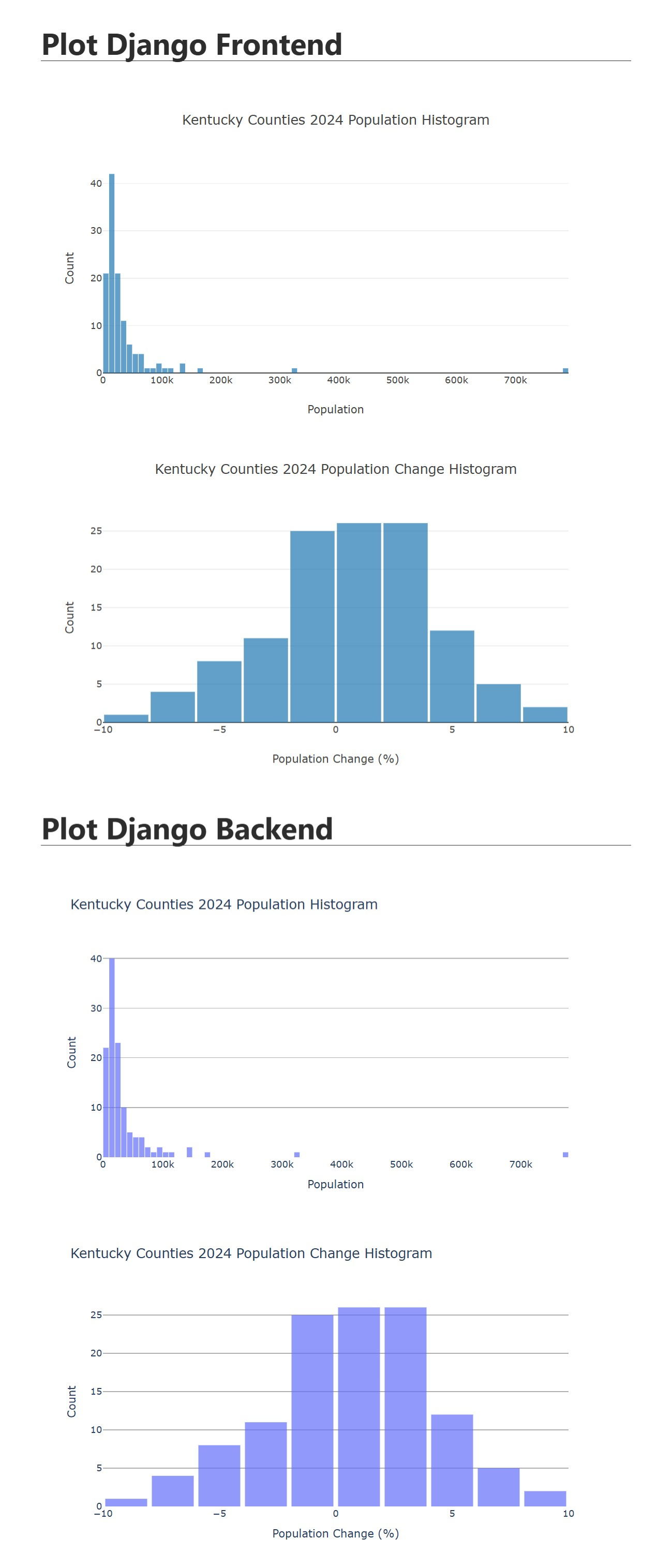
After all of this work, you should have a Django project that can display population data in plotly generated histograms. The front end will display the histograms in the browser using Plotly.js or you can create the same graphs with Plotly.py on the backend. This is a powerful combination that can be used to create interactive and visually appealing graphs for your web applications.
Using Plotly.js provides highly interactive graphs that can be manipulated directly in the browser, reducing server load by handling rendering on the client side and integrating well with various frontend frameworks. However, it requires knowledge of JavaScript, raises potential data privacy concerns due to client-side data handling, and may involve more complex setup. On the other hand, Plotly.py allows developers to stay within the Python ecosystem, processes data on the server side for better control over sensitive information, and can be simpler to set up within a Python environment. Despite these advantages, Plotly.py might not offer the same level of interactivity and responsiveness as Plotly.js, and it can increase server load with many users generating graphs simultaneously. Ultimately, the choice between Plotly.js and Plotly.py depends on the specific needs of the project.
